
As President Donald Trump continues his assault on the press, it’s important for us to hold media outlets accountable when they mistake errors. Unfortunately, cable news outlets often misreport data or intentionally manipulate data to mislead viewers. In this article, I’ll cover some of the errors CNN has made when covering the 2020 Democratic primary.
Note: The errors made by CNN aren’t as egregious as those made by MSNBC, but they’re still worth documenting.
The Graphic: August Quinnipiac Poll Results
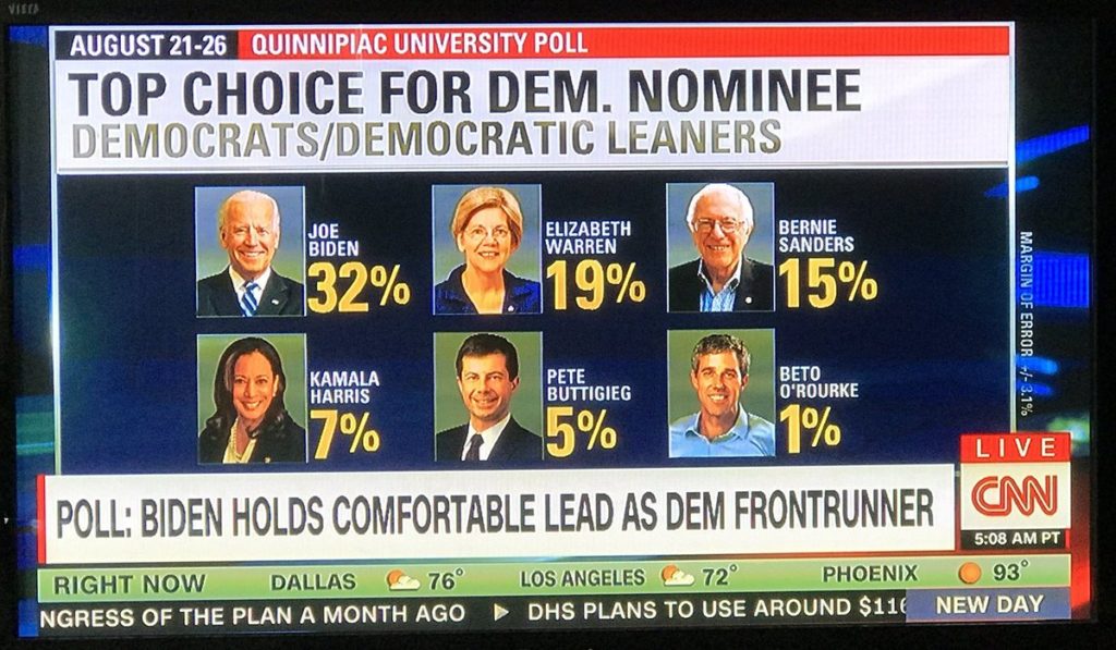
The Error:
- Andrew Yang polled at 3%, but was excluded from this graphic. Why did CNN exclude a candidate with three times the support of Beto O’Rourke?
The Graphic: August Polling “Aggregate”
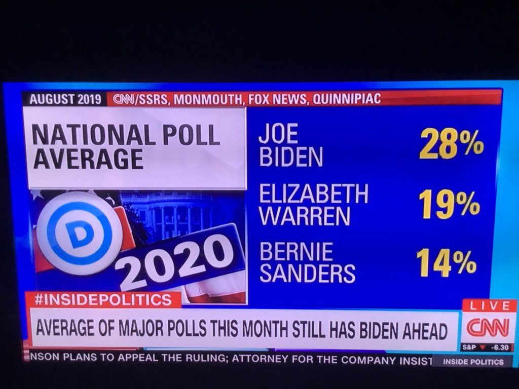
The Errors:
- This graphic excluded three August polls which drastically change the average. Had CNN included poll results from Emerson, Morning Consult, and The Hill, the averages would be: Biden (27.3), Sanders (19.2), Warren (16). Paints a slightly different picture, doesn’t it?
The Graphic: Wisconsin Poll Results
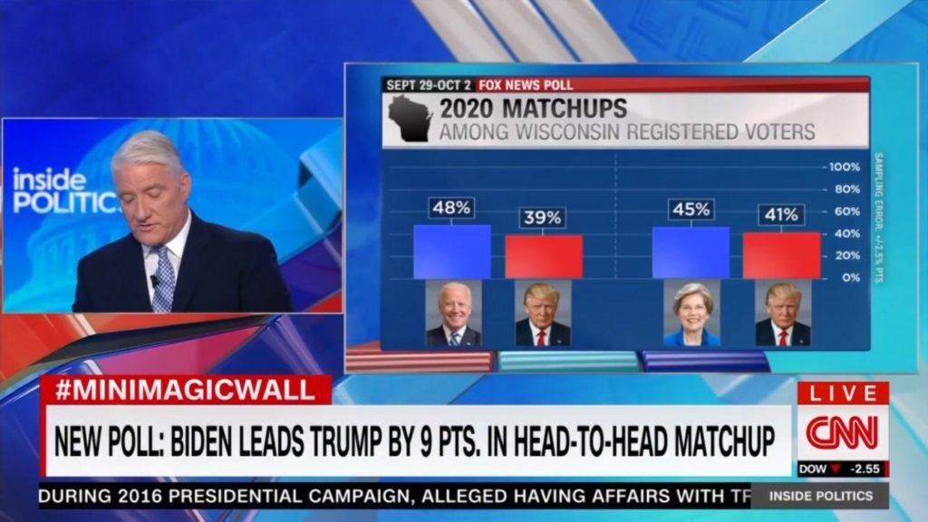
The Error:
- Bernie Sanders has a 45–40 lead over Trump in this poll, a larger lead than Elizabeth Warren has. Why isn’t Sanders included in this graphic?
- In contrast, Fox News reported all three results — it’s not that hard.
The Graphic: An Image Of Bernie Sanders
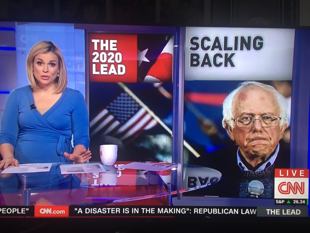
The Error:
- Bernie Sanders doesn’t have bruises on his forehead.
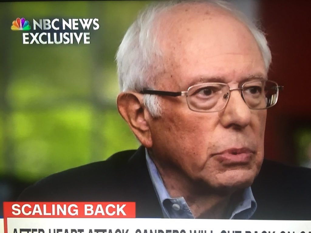
This is less of an error and more of an incredibly dishonest editorially choice. This segment ran shortly after Bernie Sanders suffered a heart attack, and for some reason CNN thought it was a good idea to use a graphic of Sanders looking like he just got out of a street fight.
That same day, Sanders did an exclusive interview with NBC. Here’s how he looked (notice the zero bruises on his forehead):
The Graphic: CNN Interview With Bernie Sanders
JUST IN: After returning from his visit to the cardiologist @BernieSanders tells us he is prepared to change the "nature" of his campaign. He said he plans to scale back his travel and the number of events he participates in. pic.twitter.com/IqUzM9stRN
— Ryan Nobles (@ryanobles) October 8, 2019
The Error:
- Bernie Sanders isn’t a lobster.
This technically isn’t a graphic, but it’s so bad that it needs to be addressed. The CNN video department should be embarrassed by the color balance in this interview with Bernie Sanders.
Here’s the same interview, recorded by CBS. As you’ll probably notice, Sanders and his wife, Jane O’Meara Sanders, look much less red.
Here's Senator @BernieSanders' full answer on getting back to the trail, referenced above pic.twitter.com/pL7OfCo7hG
— Cara Korte (@CaraKorte) October 9, 2019
The Graphic: CNN/UNH New Hampshire Poll Results
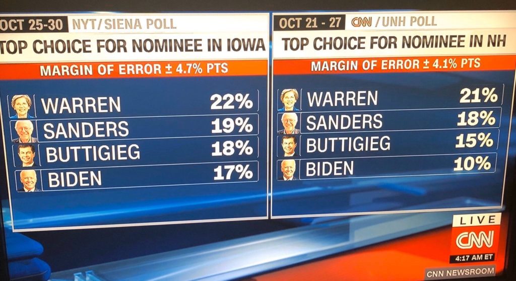
The Errors:
- The actual results of the NH poll (right): Sanders 21; Warren 18; Biden 15; Buttigieg 10.
That’s right — CNN managed to screw up every candidate’s result in their own poll in this graphic. Here are the full results of the poll.
The Graphic: Chyron Describing NYT Upshot/Siena Iowa Poll
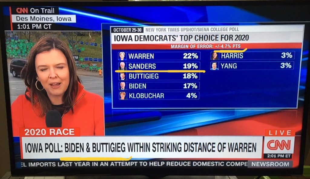
The Errors:
- Based on the poll’s margin of error, Bernie Sanders is within “striking distance” of Elizabeth Warren.
It’s difficult to understand what CNN considers striking distance. It certainly doesn’t mean polling within the margin of error of the leader, otherwise Biden wouldn’t be within striking distance of Warren. It also doesn’t mean candidates just outside the margin of error, otherwise Buttigieg wouldn’t be within striking distance of Warren.
If you know what “striking distance” is, please leave me a comment down below.
Fortunately, CNN did accurately report the results of this poll.
Did I miss anything? Let me know in the comments section below!
Be the first to comment